Advanced concepts
Page-level tokens
While our previously introduced semantic color system is highly effective in most scenarios, we've identified situations where greater control is desirable.
Consider this example: in dark mode, you might use the 'neutral-background-weak' color for your page background. However, in light mode, you may prefer a pure white background, instead of the automatic shift to an off-white. Similarly, for the header and sidebar elements, you might set their color to 'neutral-background-medium' in dark mode. But in light mode, rather than altering their color, you may choose to keep them white and simply add a border for differentiation.
This is where Once UI 3's - 'page-background', 'page-surface-background', and 'page-surface-border' - become invaluable. With just these three tokens, you can significantly impact the visual aesthetics of your design and effortlessly tweak these properties as needed.
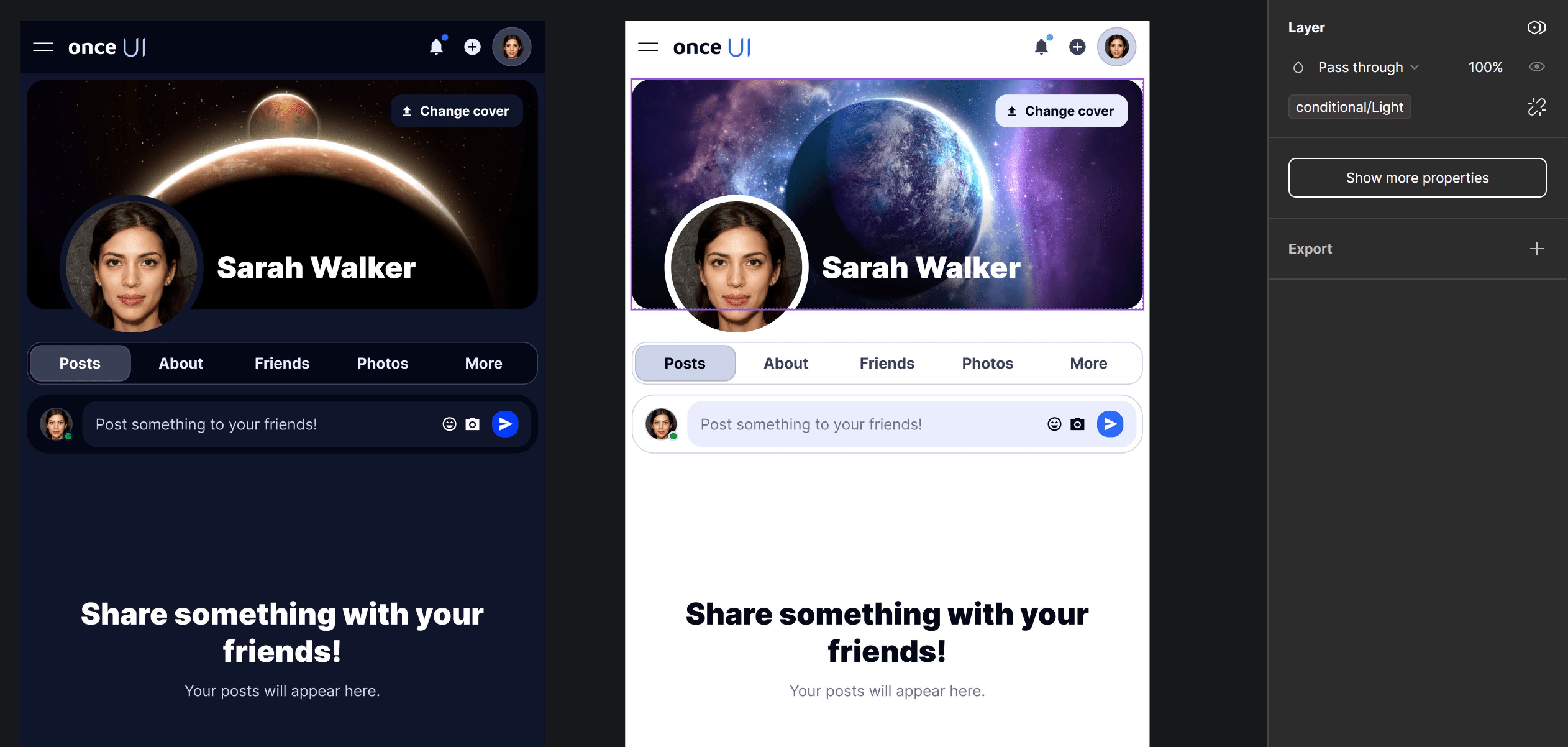
Theme-based assets
Our token system effectively manages automatic theming for the UI. However, there may be instances where you need to render different assets for light and dark modes.
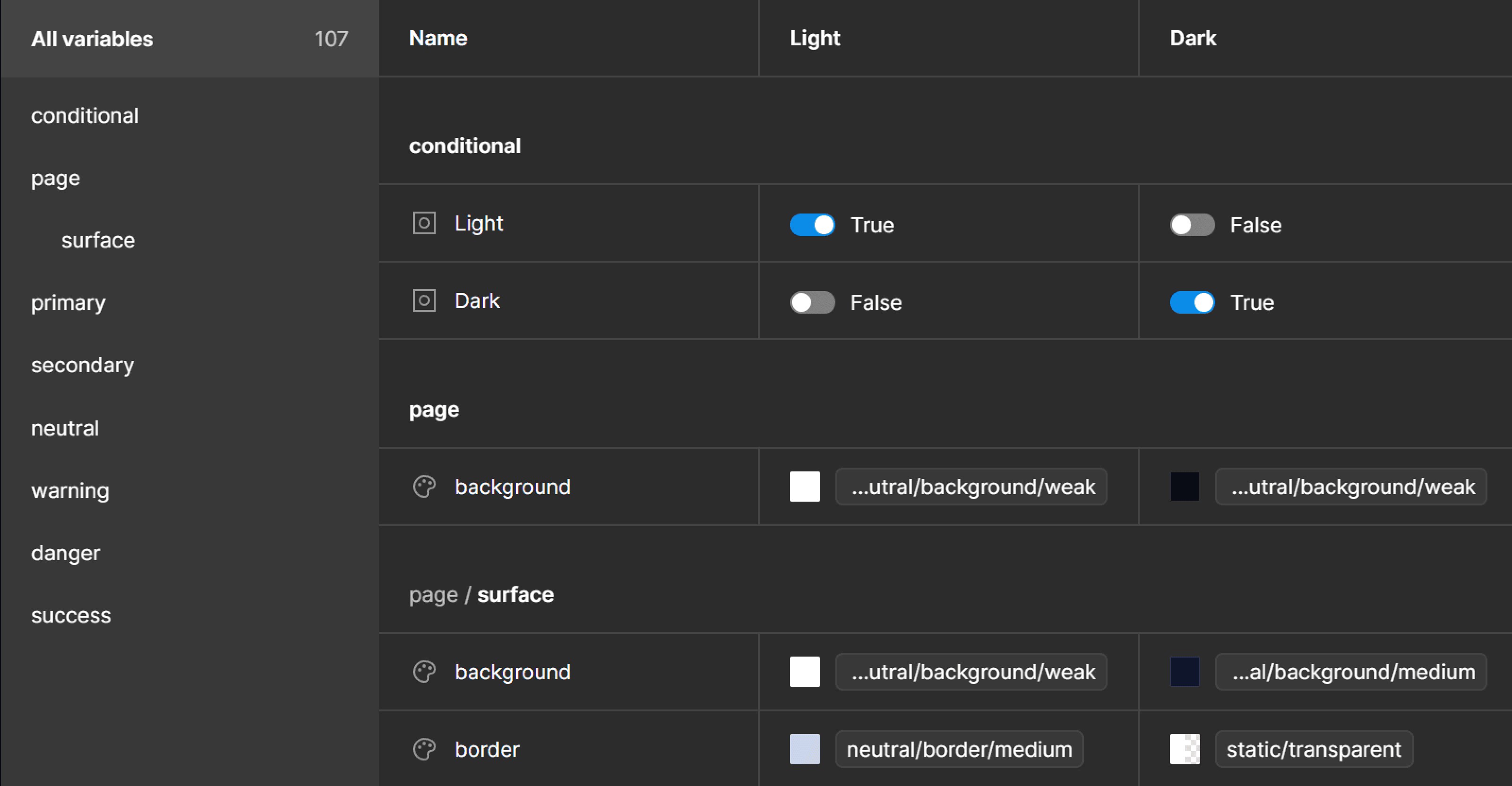
This can be conveniently achieved in Figma with the newly introduced Boolean variables from the Theme collection. Just duplicate your image, and link one copy to the Light Boolean variable and the other to the Dark Boolean variable. This straightforward approach allows for seamless switching between assets tailored for different theme modes.