Base colors
Base colors define all different colors that the user interface may use. These are raw color values, and any other (semantic- or component level) tokens are referencing these values.
If you want to update your colors, this is the place to do so.
Schemes
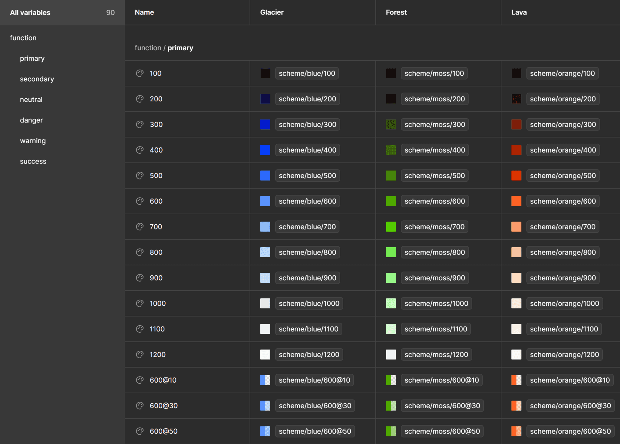
In Once UI, we call the different color spaces schemes. They provide a comprehensive and consistent initial color palette. By default, there are 16 different schemes defined in the system:
Schemes are not available to be used directly and they are excluded from publishing. These colors are meant to be aliased on the function level.
Weights
Each color scheme contains 12 weights.
Color weights have a contrast ratio tied to them, so weights have the same contrast ratio regardless of scheme. This makes theme management not only possible but accessible and consistent. Contrast ratios are measured by placing the color over a pure black background.
Functions
Modify the appearance of your product by updating the aliases for the functions to a different scheme from the base colors.
We recommend using the 6 default color functions defined in the system, but you can add as many as necessary. If you intend to use more function colors, you’ll need to update the semantic layer as well:
-> Brand colors: primary (blue) and secondary (violet)
-> Functional colors: danger (red), warning (yellow), success (green)
-> Neutral colors: neutral (slate)
Usually that’s the least you need to design a product.
Similar to schemes, functions are also not available for direct use and they are excluded from publishing. These colors are meant to be aliased on the semantic level.
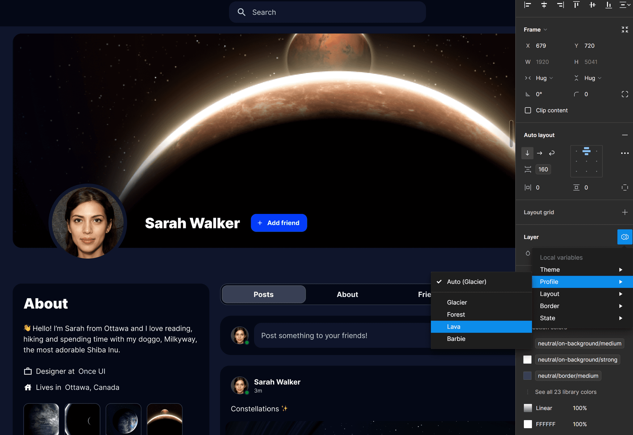
In Once UI 3, we've introduced an innovative concept of dynamic color management. This system allows the storage of multiple color profiles under variable modes. This functionality enables a single design system to cater to multiple brands. To achieve this, simply rename the color modes to correspond with different brands.
You can easily customize the pre-existing color profiles. This is done by altering the references to a different color scheme. For instance, switching the primary function from the blue scheme to the violet one instantly updates the brand color.
Switching between color profiles is straightforward. Simply select a layer and modify its default variable mode in the Profile option. This seamless process ensures that adapting to different brand aesthetics is both quick and efficient.