Semantic colors
Depending solely on base tokens for defining colors can lead to inconsistencies. With numerous base tokens and minimal differences between each weight, it's easy to stray from a cohesive color scheme.
This is where semantic tokens come into play. They reference base tokens but under more descriptive names, offering enhanced control and consistency in color selection.
Color spaces
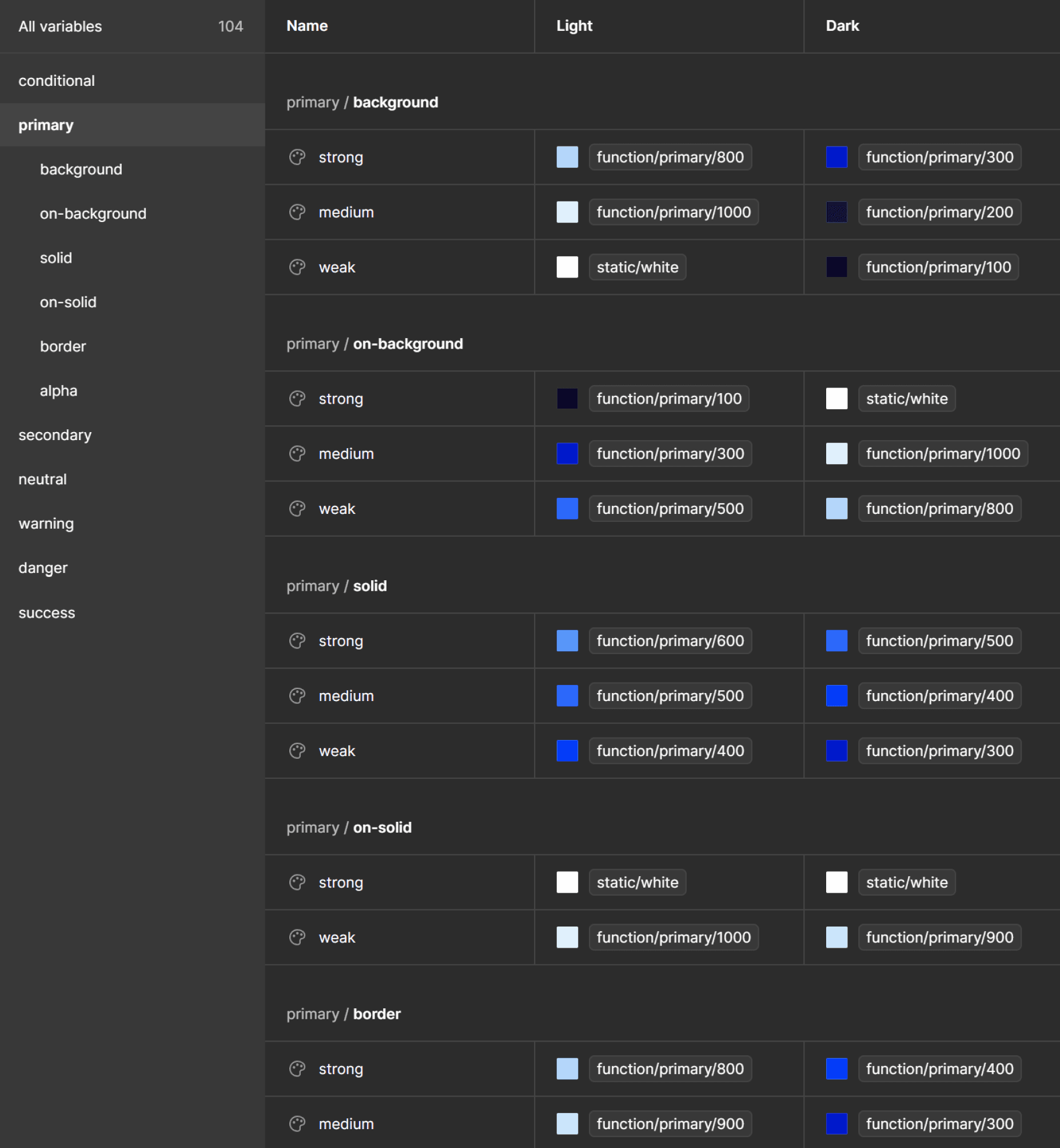
Semantic colors have the same 6 color spaces as function colors.
Categories
Schemes are organized into distinct categories. This consistent categorization across all schemes enables the seamless recreation of any component within any scheme of the system.
background
on-background
solid
on-solid
border
alpha
->
->
->
->
->
->
Surfaces being inverted at theme switching
Elements placed on background surfaces
Surfaces slightly adjusted at theme switching
Elements placed on solid surfaces
Borders of elements and dividers
Opaque values for occasional usage
Strength
Each category is defined by three distinct strengths to streamline color choices:
-> strong
-> medium
-> weak
As the strength increases, so does the contrast to offer a range of options while maintaining simplicity.
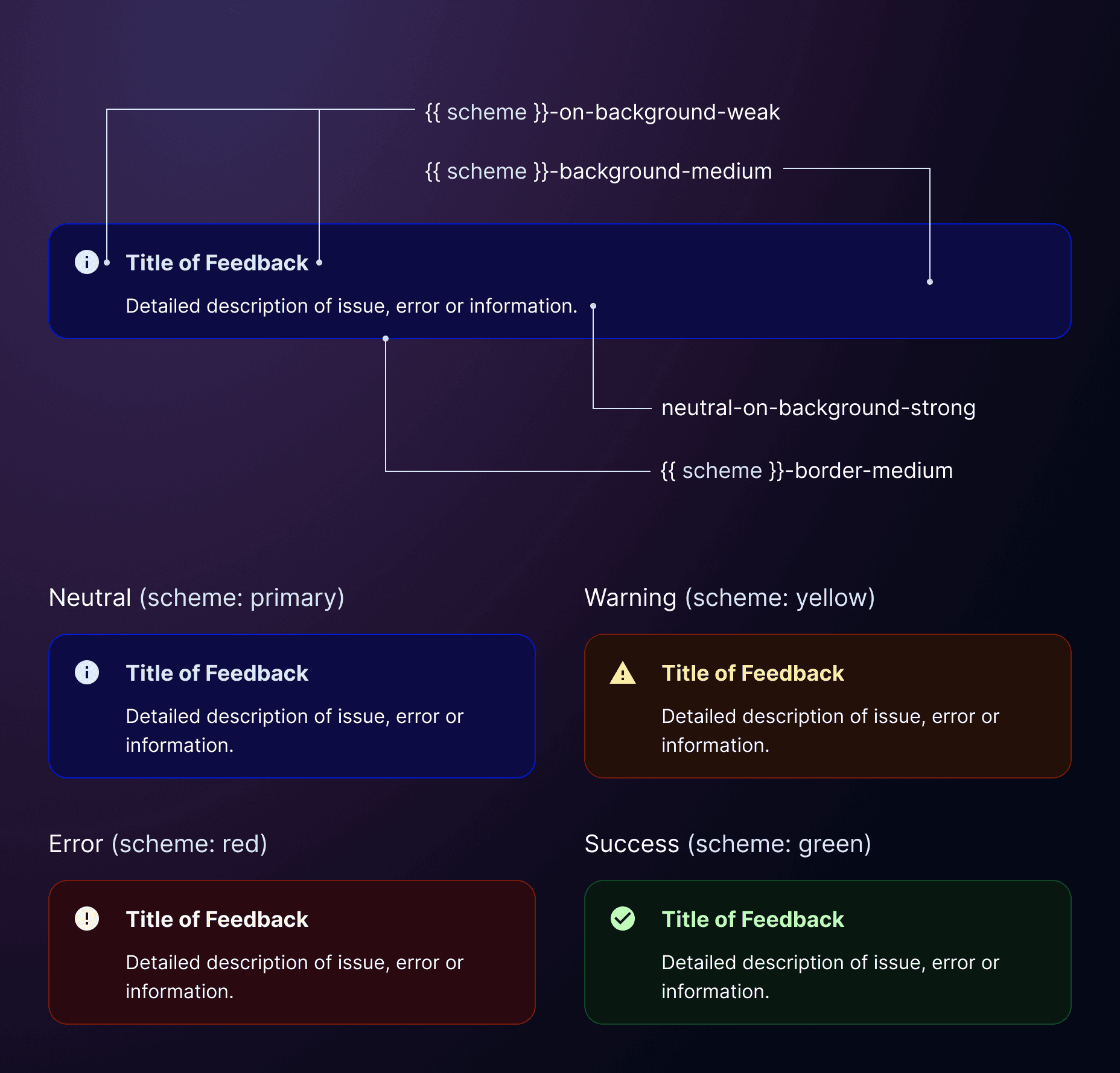
Example
This method ensures uniform theming across components, such as the ❖Feedback in Once UI. We maintain consistent contrast ratios for similar tokens and guarantee that category pairs like ‘background’ and ‘on-background’, ‘solid’ and ‘on-solid’, meet WCAG standards for accessibility.