Breakpoints (in Figma)
At the heart of responsive design are breakpoints. These are responsible for making layouts adapt seamlessly to different screen sizes.
In Figma, we can simulate breakpoints using variable modes.
First, create one for the different device sizes:
Desktop, Tablet, and Mobile.
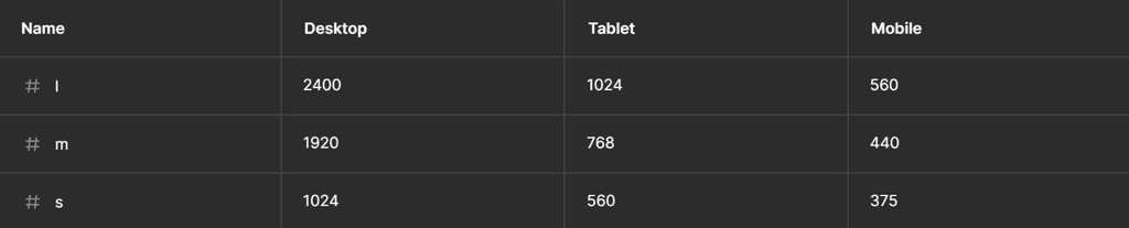
Define size variables:
Establish large (l), medium (m), and small (s) size variables for each mode.
For instance, in Once UI, we use:
-> desktop: 2400px - 1024px
-> tablet: 1024px - 560px
-> mobile: 560px - 375px
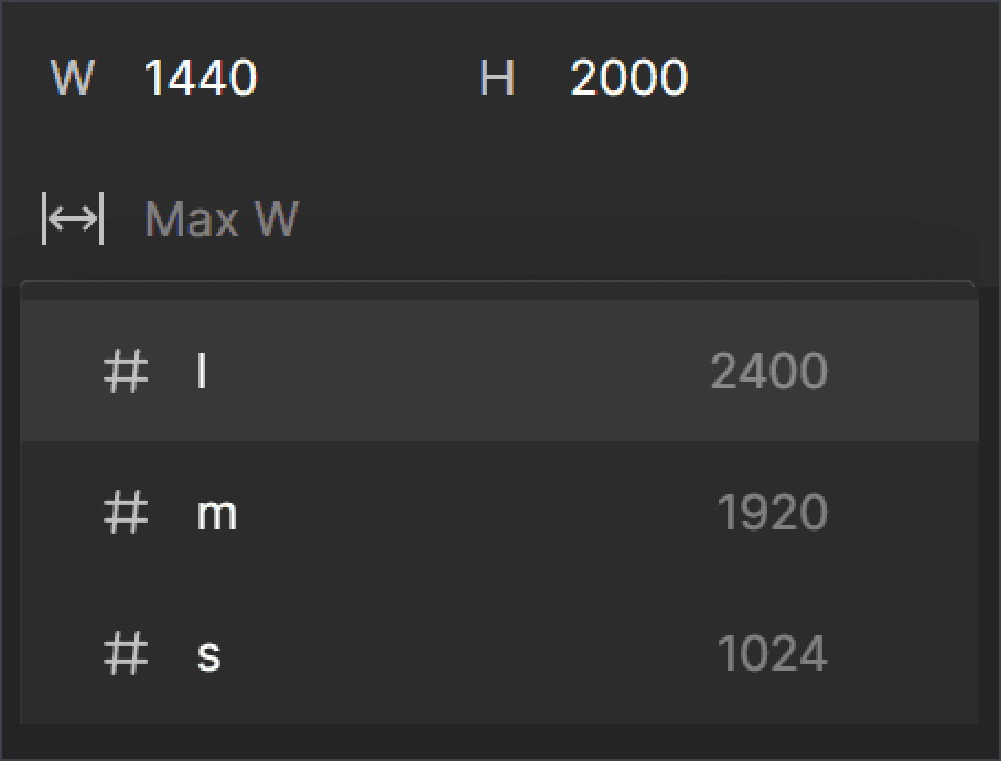
We can use the large variable as the page’s max-width and the small variable as the page’s min-width.
<- Max W
Max W ->
Switching layout
After setting the min- and max widths, you can toggle between page layouts easily with the layout variable modes.
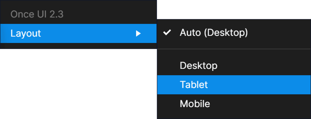
Your pages will resize only within the specified breakpoint range.