Layout shifting
One of the unique challenges in interface design arises from the orientation differences between devices. While desktop monitors are wide and horizontal, tablets and phones are primarily used in a vertical format. This discrepancy necessitates a thoughtful approach to layout adaptation across different screen sizes.
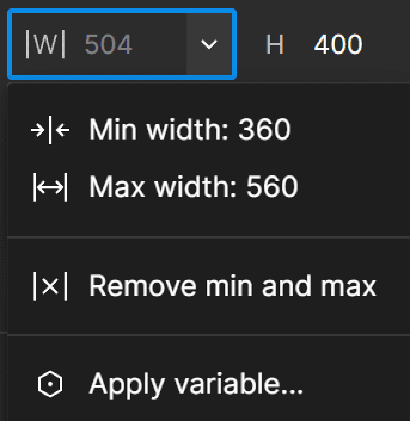
Min-max width
Ensure optimal display and legibility by defining minimum and maximum widths for elements. This approach prevents elements from stretching excessively on larger screens while maintaining a cohesive structure on smaller devices. It's a key step in preparing for wrapping. It’s essentially the same concept that we used previously to control the width of our main page element.
<- max
<- min
min ->
max ->
Wrapping
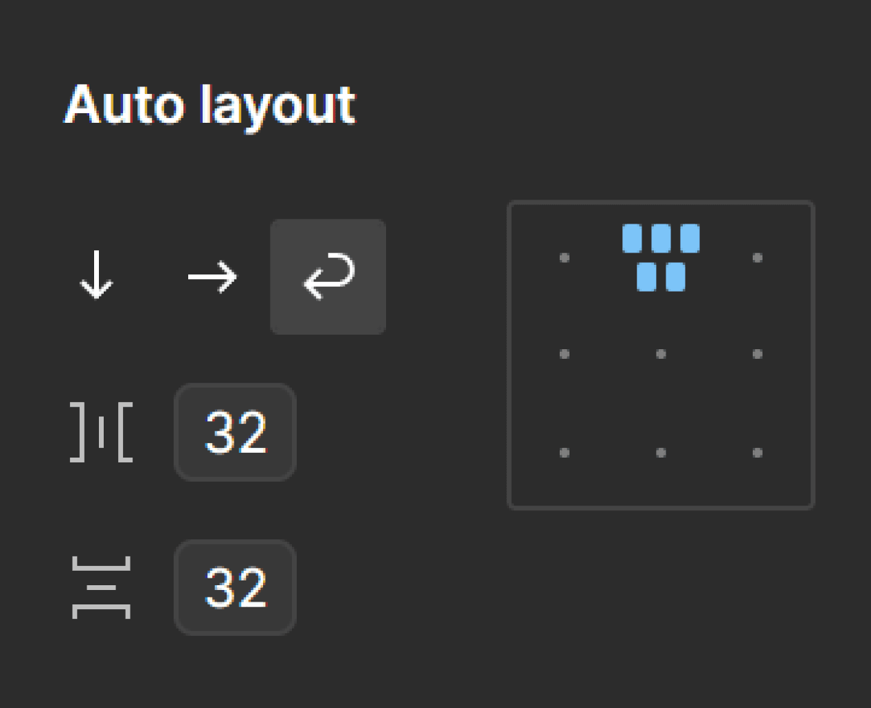
With min-max widths in place, you can set container frames to dynamically wrap child elements. As the screen size changes, these elements will automatically adjust, breaking into new rows or columns as needed.
Direction: Wrap
Overflow
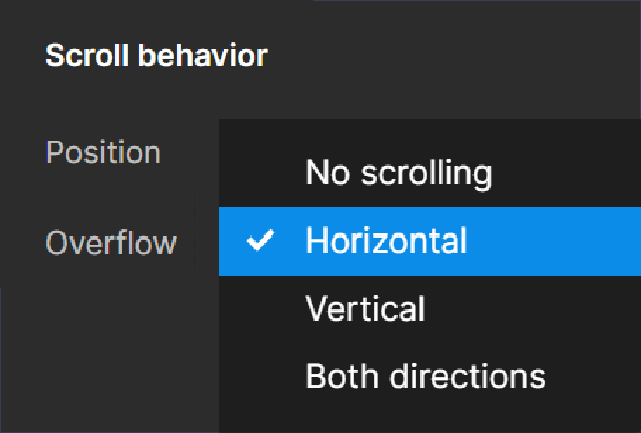
In certain scenarios, horizontal scrolling works better than wrapping – often in sections with repetitive content. Achieve this effect by setting fixed widths for child elements to create a natural overflow within a container with row direction. Next, open the prototyping settings for the parent container, and set the overflow behavior to horizontal.
Direction: Row
Overflow: Horizontal scroll
<- fixed ->
<- fixed ->
<- fixed ->