Conditional rendering
Responsive design encompasses three key aspects: Scaling, Layout shifting and Conditional rendering. We've already explored the first two, so let's delve into conditional rendering.
Conditionals
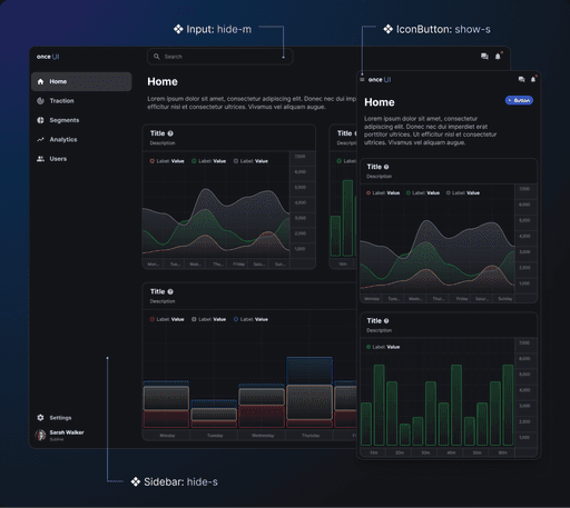
Conditional logic involves displaying certain elements based on specific conditions, typically related to screen size. For instance, you might want to display a sidebar only on desktop screens but hide it on mobile devices.
To implement this in your designs, you can use conditional logic to show or hide elements as needed, aligning your design process closely with development.
Variables
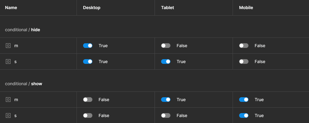
Start by creating a set of boolean variables within your Layout collection with different values depending on the breakpoint:
-> hide-m: Set to false on tablet and mobile screens
-> hide-s: Set to false only on mobile screens
-> show-m: Set to true on tablet and mobile screens
-> show-s: Set to true only on mobile screens
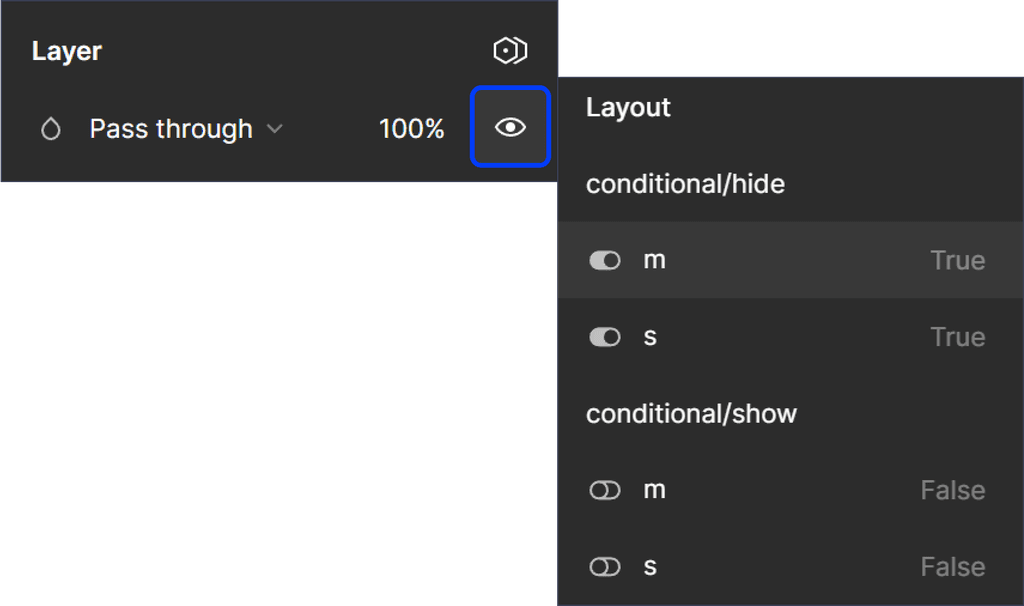
With these variables in place, you can now conditionally render elements based on the current breakpoint. Simply select a component or frame, right-click on the visibility (eye) icon in the Layer section, and choose the appropriate variable.
Revisiting the previous example, to display the sidebar only on desktop screens, link it to the hide-m variable.
Example
Take a moment to recognize the nuanced variations between the desktop and mobile versions in the example below, achieved with conditional rendering.